Case study
PixitMedia
Moving from a tech first to a user first organisation through design.
55%
Improved Onboarding Process for a fintech startup
1
Unified multiple apps into one platform, improving scalability
4.5
Increased NPS from 3.1 to 4.5 stars after the redesign


Team
Design director, lead designer.
What we did
Design
Deliverables
Website
App
Duration
34 weeks
Tech stack
Figma
Pixit Media users faced increasing tool complexity and clunky navigation as they navigated multiple apps that had been developed during Pixit’s impressive growth. A fragmented user experience was hindering Pixit’s scalability and market competitiveness.
Problem statement
Pixit Media users faced increasing tool complexity and clunky navigation as they navigated multiple apps that had been developed during Pixit’s impressive growth. A fragmented user experience was hindering Pixit’s scalability and market competitiveness.
Hypothesis
A full product redesign from a user-first perspective will create a more unified user experience, enhancing Pixit’s growth by reducing churn from existing users and simplifying onboarding for new users.
Solution
Pixit Media’s product was highly technical, meaning Rise needed to work closely with existing users to build empathy, map workflows end-to-end and uncover pain-points.
Rise used a jobs-to-be-done approach while conducting extensive user interviews to emphasise the product’s core value drivers
Consistent weekly meetings and a single point of contact were integrated into Pixit’s schedule, empowering stakeholders with clear communication on tech and product trade-offs.
Rise tested numerous Figma wireframe prototypes with user groups to refine the product, ensuring seamless flows between different Pixit services.
Pixit’s Net Promoter Score rose from 3.1 to 4.5 stars, and customer assistance needs decreased by 55% within a year of the launch thanks to Pixits shift from a tech-first to a user-first approach.
Pixit Media users faced increasing tool complexity and clunky navigation as they navigated multiple apps that had been developed during Pixit’s impressive growth. A fragmented user experience was hindering Pixit’s scalability and market competitiveness.
Read more
Pixit Media users faced increasing tool complexity and clunky navigation as they navigated multiple apps that had been developed during Pixit’s impressive growth. A fragmented user experience was hindering Pixit’s scalability and market competitiveness.
Problem statement
Pixit Media users faced increasing tool complexity and clunky navigation as they navigated multiple apps that had been developed during Pixit’s impressive growth. A fragmented user experience was hindering Pixit’s scalability and market competitiveness.
Hypothesis
A full product redesign from a user-first perspective will create a more unified user experience, enhancing Pixit’s growth by reducing churn from existing users and simplifying onboarding for new users.
Solution
Pixit Media’s product was highly technical, meaning Rise needed to work closely with existing users to build empathy, map workflows end-to-end and uncover pain-points.
Rise used a jobs-to-be-done approach while conducting extensive user interviews to emphasise the product’s core value drivers
Consistent weekly meetings and a single point of contact were integrated into Pixit’s schedule, empowering stakeholders with clear communication on tech and product trade-offs.
Rise tested numerous Figma wireframe prototypes with user groups to refine the product, ensuring seamless flows between different Pixit services.
Pixit’s Net Promoter Score rose from 3.1 to 4.5 stars, and customer assistance needs decreased by 55% within a year of the launch thanks to Pixits shift from a tech-first to a user-first approach.
Pixit Media users faced increasing tool complexity and clunky navigation as they navigated multiple apps that had been developed during Pixit’s impressive growth. A fragmented user experience was hindering Pixit’s scalability and market competitiveness.
Problem statement
Pixit Media users faced increasing tool complexity and clunky navigation as they navigated multiple apps that had been developed during Pixit’s impressive growth. A fragmented user experience was hindering Pixit’s scalability and market competitiveness.
Hypothesis
A full product redesign from a user-first perspective will create a more unified user experience, enhancing Pixit’s growth by reducing churn from existing users and simplifying onboarding for new users.
Solution
Pixit Media’s product was highly technical, meaning Rise needed to work closely with existing users to build empathy, map workflows end-to-end and uncover pain-points.
Rise used a jobs-to-be-done approach while conducting extensive user interviews to emphasise the product’s core value drivers
Consistent weekly meetings and a single point of contact were integrated into Pixit’s schedule, empowering stakeholders with clear communication on tech and product trade-offs.
Rise tested numerous Figma wireframe prototypes with user groups to refine the product, ensuring seamless flows between different Pixit services.
Pixit’s Net Promoter Score rose from 3.1 to 4.5 stars, and customer assistance needs decreased by 55% within a year of the launch thanks to Pixits shift from a tech-first to a user-first approach.
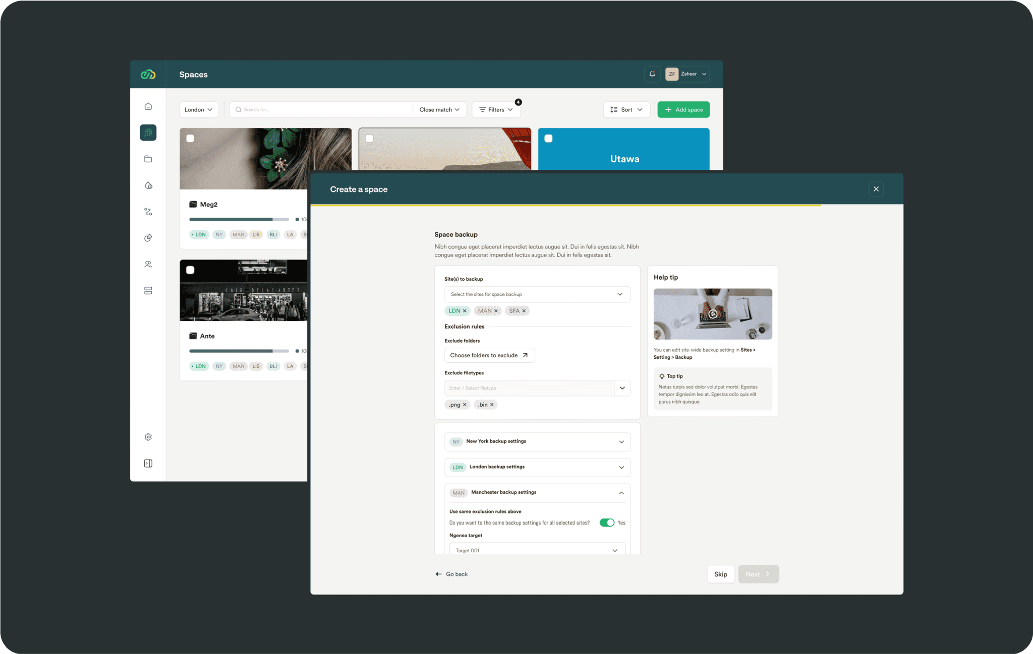
We designed a look and feel for the landing page. This was an opportunity to use the branding styles used in the UI in a more impactful way.
We landed on a number of design templates that would be reused throughout the platform to iad usability. The creation flow used ‘progressive disclosure’ to help keep thr users engaged throughout the process.
The high fidelity designs were based on an existing design system, chosen by client and design team. This helped us deliver faster.
Once items have been created, a side panel design was used to give quick edit access. Ancor links were incorporated to easily jump to the different sections.
The spaces browser page was constructed to allow navigation to allow maximum control over files by users. The collapsible right hand panel was designed to offer full insights into folders anf files. Both this and the file table can be customised to accommodate the different use cases.
The spaces browser page was constructed to allow navigation to allow maximum control over files by users. The collapsible right hand panel was designed to offer full insights into folders anf files. Both this and the file table can be customised to accommodate the different use cases.
Read the next case study
We brought Easy Estate’s vision to life.
Grow your bottom line, not your payroll.
Replace three hires with one subscription.
Replace three hires with one subscription.
Replace three hires with one subscription.
Replace three hires with one subscription.
Replace three hires with one subscription.
Trusted by founders, agencies and scaleups worldwide
Let's go
Add your details below so we can prepare for our discovery call with an expert.
Copyright Rise 2025. Designed using Rise.
Cookies
Privacy
Your AI Partners
Rise Lisbon
Mercado de Ribeira
Av. 24 de Julho 1o andar
1200-479 Lisboa
Rise Amsterdam
Herengracht 124-128,
1015 BT Amsterdam,
Netherlands
Your AI Partners
Rise Lisbon
Mercado de Ribeira
Av. 24 de Julho 1o andar
1200-479 Lisboa
Rise Amsterdam
Herengracht 124-128,
1015 BT Amsterdam,
Netherlands
Your AI Partners
Rise Lisbon
Mercado de Ribeira
Av. 24 de Julho 1o andar
1200-479 Lisboa
Rise Amsterdam
Herengracht 124-128,
1015 BT Amsterdam,
Netherlands
Your AI Partners
Rise Lisbon
Mercado de Ribeira
Av. 24 de Julho 1o andar
1200-479 Lisboa
Rise Amsterdam
Herengracht 124-128,
1015 BT Amsterdam,
Netherlands
Your AI Partners
Rise Lisbon
Mercado de Ribeira
Av. 24 de Julho 1o andar
1200-479 Lisboa
Rise Amsterdam
Herengracht 124-128,
1015 BT Amsterdam,
Netherlands
Elevate Your
Execution
Speak to one of our experts about your project—book a call today.
Elevate Your
Execution
Speak to one of our experts about your project—book a call today.
Elevate Your
Execution
Speak to one of our experts about your project—book a call today.
Elevate Your
Execution
Speak to one of our experts about your project—book a call today.
Elevate Your
Execution
Speak to one of our experts about your project—book a call today.

